
Mobile-Friendly HVAC Website: How to Improve Your Website for Mobile Users
An HVAC customer may visit your website while dealing with a heating or cooling problem. They may have only a phone and a few minutes to find a service, check your coverage area, and contact your company. If the page is hard to use, the visitor has to work harder than necessary.
A mobile-friendly HVAC website makes those tasks straightforward. It adapts to different screen sizes, keeps important information readable, provides controls that are easy to tap, and lets visitors call or request an estimate without fighting the layout. It is more than a desktop website squeezed onto a smaller screen.
This guide focuses on practical mobile usability improvements HVAC business owners can inspect themselves or discuss with their web developer.
Table of Contents
1. Build a responsive layout that works beyond one phone size
Responsive web design allows a page layout to adapt to the available screen width. A desktop layout with three columns, a wide hero image, and a large navigation menu may look balanced on a monitor but become cramped when displayed on a phone.
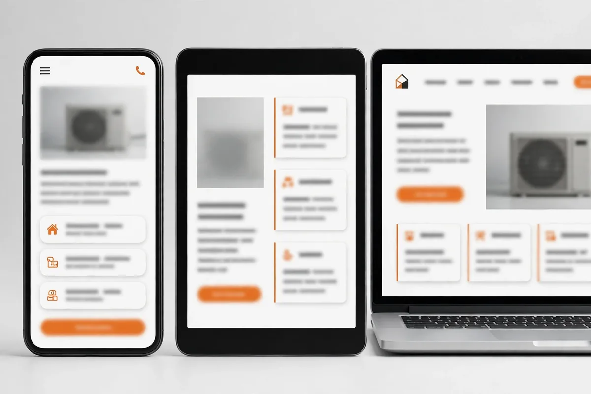
For an HVAC website, check the homepage, service pages, service-area pages, and contact page. On a narrow screen:
- Stack columns into a clear single-column reading order.
- Keep the logo and navigation usable without taking over the screen.
- Make service cards fit the viewport instead of shrinking their text.
- Ensure headings and buttons wrap naturally rather than overlapping.
- Keep the main call to action visible without covering important content.
- Check tablet widths as well as small and large phones.
Test narrow viewports around 320–360 CSS pixels, common phone widths around 375–430 pixels, and tablet widths around 768 pixels. These are practical test points, not an exhaustive device list.
Google recommends responsive design as a straightforward approach. Keep important service information available on mobile rather than hiding substantial content to shorten the page. For broader planning context, see the complete HVAC website design guide.
2. Make text easy to read without zooming
A page can fit a phone screen and still be uncomfortable. Small text, tight spacing, long lines, and weak contrast make information harder to understand.
Review the mobile version of each important page and ask someone to read it at normal zoom. Body text should be comfortably readable, paragraphs should have enough line spacing, and headings should be visually distinct without taking up several screens. Avoid long all-caps headings and large blocks of bold text.
Check the following:
- Start with a readable body-text size, commonly around 16 CSS pixels, then test it on real devices. This is a design starting point, not a universal legal threshold.
- Keep paragraph line lengths comfortable; do not let text run edge to edge.
- Use sufficient contrast between text and its background.
- Leave clear spacing between paragraphs, headings, lists, and buttons.
- Avoid placing text over busy photographs unless a solid overlay preserves legibility.
- Do not require pinch-to-zoom to read normal page content.
A service page should make its heading, description, and “Call Now” action visually distinct. If they blend together on a small screen, adjust typography and spacing.
3. Make buttons and navigation comfortable to tap
Phone users interact with fingers, so controls need enough size and separation to avoid accidental taps.
Give important actions a clear visual treatment. Buttons such as “Call Now,” “Request an Estimate,” and “View Services” should have descriptive labels, sufficient padding, and visible spacing from nearby links. Avoid placing two competing buttons so close that a visitor can easily tap the wrong one.
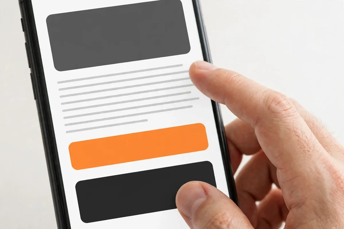
The W3C WCAG 2.2 minimum target-size criterion generally calls for pointer targets of at least 24 by 24 CSS pixels, subject to listed exceptions. That is a minimum accessibility criterion, not a recommendation to make every business button only 24 pixels. For prominent touch controls, consider a more generous target—often around 44–48 CSS pixels in height—where the design allows.
Check that the mobile menu opens and closes reliably, exposes essential links, and remains usable after scrolling. A sticky header should not cover page content or occupy too much screen space.
4. Make the HVAC phone number a working tap-to-call link
A click-to-call link lets a mobile visitor open the phone app with the business number ready to call.
Use a properly formatted telephone link, for example:
<a href="tel:+15551234567">Call (555) 123-4567</a>
The number is illustrative only. Use the company’s verified number and correct country code; never publish the sample as a business contact.
Place the phone action in the header, near relevant service-page actions, and on the contact page. If locations use different numbers, verify each routes correctly.
Test the link on an actual phone. Confirm that tapping it opens the dialer with the correct number. Also check that the number is visible as text for visitors who prefer to copy it or use assistive technology. Do not rely on a decorative phone icon with no accessible label.
5. Simplify quote request and contact forms
A desktop-friendly form can become tedious on a phone. Long forms, tiny fields, unclear labels, and poor error messages interrupt estimate requests.
Ask only for information needed to respond, such as a name, contact detail, service location, service type, and short message. Collect extra details during follow-up if necessary.
Improve mobile forms by:
- Using visible labels rather than relying only on placeholder text.
- Choosing suitable input types, such as telephone and email.
- Making fields and submit buttons easy to tap.
- Keeping related fields together and using a logical top-to-bottom order.
- Marking required fields clearly.
- Showing specific, understandable error messages beside the relevant field.
- Preserving valid entries when a submission error occurs.
- Displaying a clear confirmation after successful submission.
- Testing the form with the phone keyboard and autofill.

Stack fields vertically on narrow screens. Test a valid submission, a missing required field, error correction, and delivery to the correct inbox or CRM. A form that does not deliver enquiries is not finished.
6. Improve mobile loading and interaction performance
Mobile visitors may have slower connections or less powerful phones. Heavy hero images, unnecessary animations, third-party scripts, and oversized page assets can make pages feel unresponsive.
Start with the first screen: compress images, avoid autoplay backgrounds, remove unnecessary scripts and widgets, and review font loading. Avoid overlapping optimization plugins or blind cache changes; test after each change.
Google’s Core Web Vitals provide useful measurements of real-world loading, responsiveness, and visual stability. For a wider look at website value, read about the benefits of professional HVAC website design. Current “good” targets are:
- Largest Contentful Paint (LCP): 2.5 seconds or less.
- Interaction to Next Paint (INP): 200 milliseconds or less.
- Cumulative Layout Shift (CLS): 0.1 or less.
These are measured at the 75th percentile of page visits, segmented by device type. A single Lighthouse run is useful for diagnosis but is not the same as field data from actual visitors. Use PageSpeed Insights and Search Console’s Core Web Vitals report where available, then investigate the specific elements causing poor results.
7. Use mobile-ready images and prevent layout shifts
Large desktop images consume mobile data and push content down. Use responsive image delivery, compress photographs, and use formats such as WebP where supported.
Use images with a clear purpose and write alt text that describes meaningful images accurately. Do not force the target keyword into every image description.
Prevent content from jumping as the page loads. Set image dimensions or aspect ratios so the browser can reserve space before an image appears. Make sure embedded maps, videos, review widgets, and form elements also have stable dimensions.
On mobile, check for:
- Images wider than the viewport.
- Tables that force horizontal scrolling.
- Buttons or headings overlapping photographs.
- Text clipped by fixed-height containers.
- Sticky elements covering content.
- Unplanned gaps caused by hidden desktop widgets.
If a comparison table is too wide, simplify it or provide a mobile-friendly stacked presentation rather than forcing visitors to scroll sideways.
8. Test the real customer journey on phones
Responsive previews do not replace physical-device testing. Chrome DevTools Device Mode approximates screen sizes and conditions, but real phones are still needed.
Use this practical test sequence:
- Open the homepage on an iPhone and an Android phone if available.
- Find a specific service, such as air conditioning repair or furnace installation.
- Check whether the service description and service area are easy to understand.
- Tap the phone number and confirm the correct number opens in the dialer.
- Return and submit the quote form, including an intentional validation error.
- Open and close the navigation menu.
- Scroll through the page and check images, headings, buttons, and footer links.
- Repeat at a narrow viewport and a larger phone or tablet width.
- Test in more than one mobile browser where possible.
- Repeat after changes are made.

Test service pages as well as the homepage; visitors may land directly on them from search results.
9. Common mobile usability problems to fix first
| Problem | What the visitor experiences | Practical fix |
|---|---|---|
| Desktop layout squeezed onto a phone | Tiny columns and cramped text | Stack content and adjust responsive breakpoints |
| Small navigation links | Accidental taps or missed links | Increase target size and spacing |
| Phone number is not clickable | Visitor must copy or dial manually | Add and test a tel: link |
| Long or awkward form | Enquiry is abandoned or difficult to submit | Remove unnecessary fields and improve labels |
| Oversized hero image | Main information loads slowly | Resize, compress, and serve responsive images |
| Content jumps during loading | Visitor loses their place or taps the wrong control | Reserve space using dimensions or aspect ratios |
| Sticky header covers content | Headings and buttons become obscured | Adjust sticky behavior and mobile header height |
| Wide table or widget | Page scrolls sideways | Reformat for narrow screens |
Fix problems that block calls or quote requests before minor decorative issues.
10. Mobile-friendly HVAC website checklist
Use this checklist to review your website. Mark an item complete only after testing it, not simply because the setting exists in the page builder.
| Check | What to verify |
|---|---|
| Responsive layout | No clipped or overlapping content at narrow, common, and tablet widths |
| Readable content | Body text is legible at normal zoom with comfortable spacing |
| Navigation | Menu opens, closes, and exposes the important pages |
| Tap targets | Buttons and links are easy to select without hitting adjacent controls |
| Phone links | Correct business number opens in the phone dialer |
| Contact form | Fields, labels, validation, submit action, and confirmation work |
| Page performance | Large images and unnecessary scripts are controlled; metrics are reviewed |
| Image stability | Images reserve space and do not cause unexpected page movement |
| Page width | No unintended horizontal scrolling |
| Key journeys | A visitor can find a service, check coverage, call, and submit an enquiry |
| Real-device testing | At least one iPhone and Android device are tested where available |
| Browser testing | Important pages work in current mobile browsers |
Fix failures in this order: first, anything that prevents a visitor from calling or submitting an enquiry; second, layout and readability problems that block understanding; third, performance and visual stability issues; and finally, minor presentation refinements. Re-test the affected journey after each change.
Frequently Asked Questions
A mobile-friendly HVAC website adapts to different screen sizes and lets visitors read service information, navigate, call the business, and submit a request without zooming, horizontal scrolling, or struggling with controls.
If the business accepts enquiries by phone, a visible click-to-call link is useful for mobile visitors. It must use the correct verified phone number and should be tested on a real phone.
Use responsive browser tools to inspect multiple viewport widths, then test the important pages and customer actions on real iPhone and Android devices where possible. Check navigation, phone links, forms, readability, page width, and loading behavior.
WCAG 2.2 Level AA includes a 24-by-24 CSS-pixel minimum target-size criterion with exceptions. For prominent actions, larger and well-spaced buttons are often easier to use. Choose sizes based on the design and test them with real touch interaction.
Yes. Faster loading and responsive interaction make it easier for visitors to reach information and use forms. Review real-user Core Web Vitals data where available and investigate the specific images, scripts, or layout elements causing problems.
Conclusion: Make every important mobile action easy
A mobile-friendly HVAC website should help visitors move from a question to a next step. The layout must adapt, text remain readable, buttons be easy to tap, phone links work, and forms be practical.
Start by testing the pages that matter most to enquiries. Try finding a service, checking the service area, calling the company, and sending a quote request on a real phone. Fix the problems that interrupt those tasks first, then review loading performance and visual stability.
If your website needs a broader design or development improvement, explore HVAC Web Design services.

About the Author
Tanvir Siddiki
Founder & HVAC Web Design SpecialistTanvir is the founder of HVAC Web Design Lab, specializing in website design, website redesign, and local SEO for HVAC businesses. He focuses on creating professional, user-friendly websites that help heating and cooling companies strengthen their online presence.
One Comment